blog
designing prose & codes
January 24, 2022
- prose & codes
- art & design
When I’m bored, I like to make mockups for games that will probably never be made. Back in 2018, I had an idea for a simple cipher game that would encrypt quotes from classic literature.
I've always been a bookworm, so it was a natural source of material for me. I made a basic mockup and promptly forgot all about it--after all, we were still knee-deep in the long development of
Anagrams, and I had no idea (nor any interest in learning) how to code on my own.
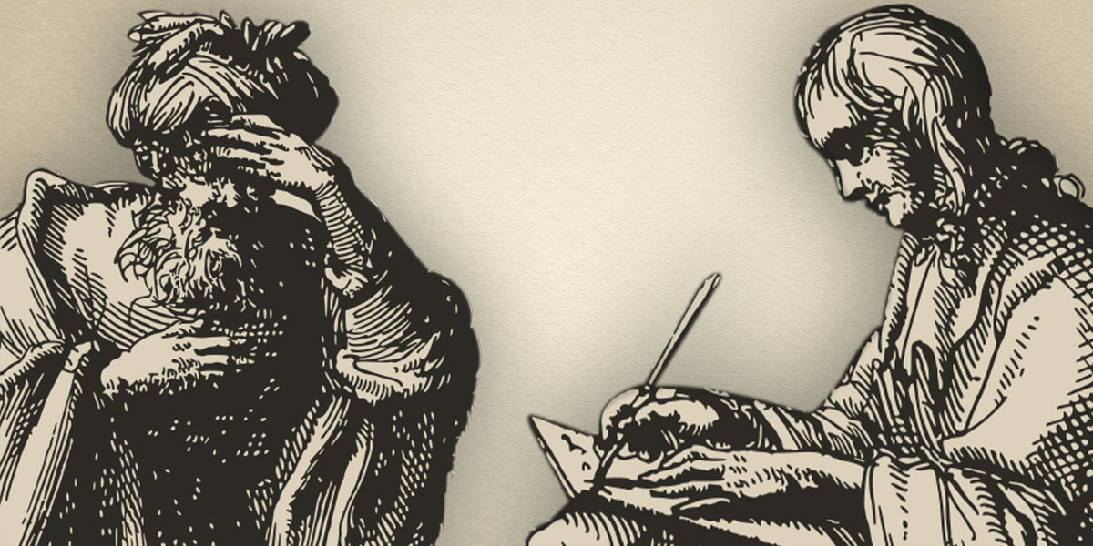
The first rough design of what would eventually become Prose & Codes
Fast forward to February 2021--Anagrams had only been out for a month, but we were really eager to get started on something else. However, one of the major lessons we learned was that we needed another coder.
Much to Carl’s delight, I agreed to at least try.
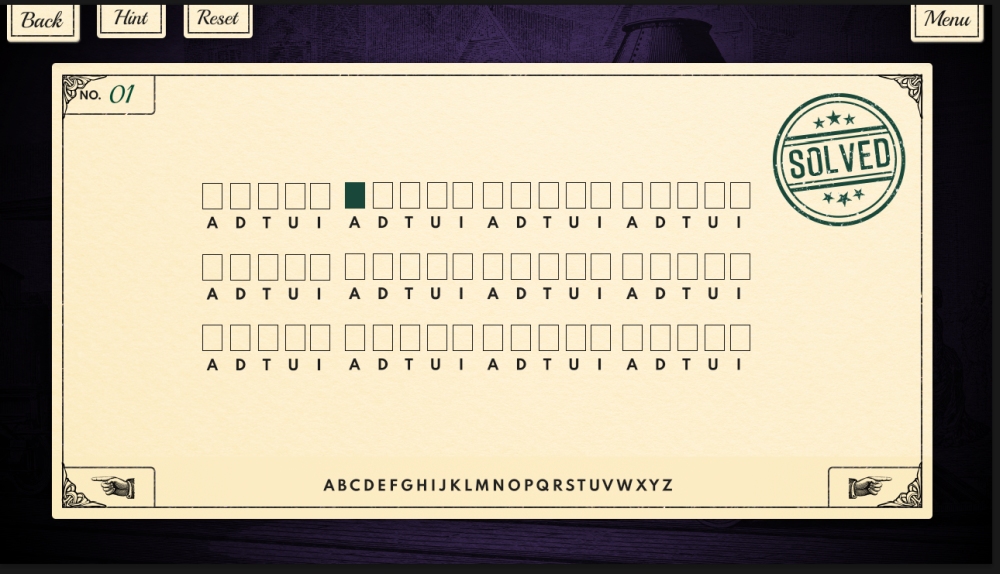
We wanted a game that was simple enough to teach me the fundamentals of programming, and after a bit of deliberation, I decided on substitution ciphers. They’ve always been one of my favorite codes, and they are
so much fun (and easier) to solve on the computer.
Even for prototypes, I love going ahead and making a cohesive design (though this is probably a waste of time.) At the time, I was reading some of Neil Postman’s books--Amusing Ourselves to Death and Technopoly
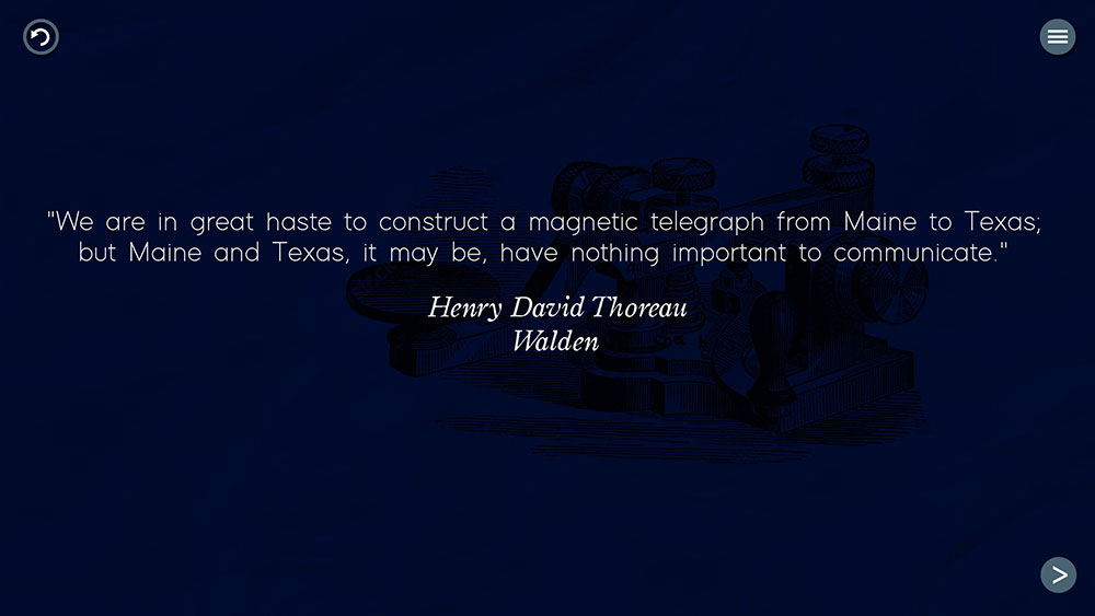
--and just thinking a lot about how technology has shaped human life. When Samuel Morse--one of the inventors of the telegraph--was asked to send the very first telegram, it is said that he chose: “What hath God wrought?”
That quote really struck a chord. I felt there was a wonderful and spirited debate to be had between critics like Postman and those who are more techno-optimistic, and I thought it would be fun to spark that conversation
in players. How better to do that than to expose players to a multitude of quotes representing different viewpoints? And so, a little game known as What Hath God Wrought? was born.
Kill Your Darlings: Part 1
I whipped up a rough design very quickly. Everything was going to be based around a timeline of technological innovation. Players would unlock pivotal inventions, learn about them, and then decode what their creators,
critics, and enthusiasts had to say about them.
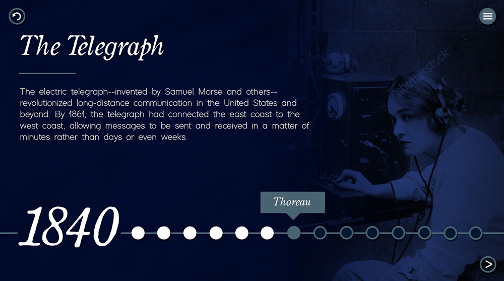
A level select screen. Each dot on the timeline represents a cipher related to the telegraph.
As you can see, I can be quite lazy with my mockups, but hopefully you get the idea.
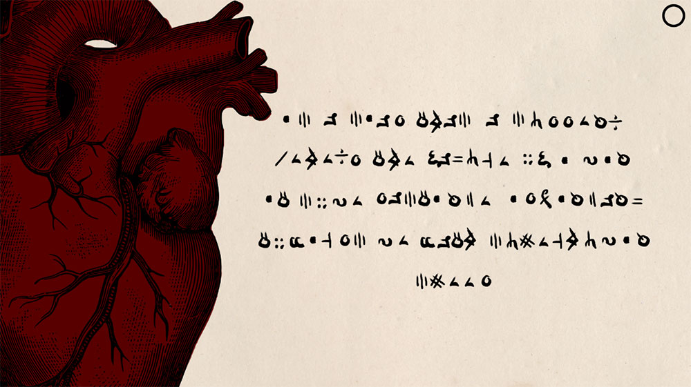
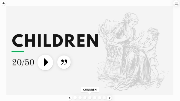
A “win” screen, where players can see the quote in an easy-to-read format.
It was a very simple game with a very simple design, and I was absolutely married to four parts of it: a specific font, only four game screens (menu, level select, cipher, and win), the timeline, and the technological
theme. In the end, I had to let go of them all.
I won’t defend my odd attachment to the font, but the whole point of this project was that it should be a very small game. I did not want to program a bunch of complicated game screens. And as for the timeline--the entire
game revolved around it.
Yet, try as I might, I could not figure out how to make the game what I wanted it to be. I needed players to be able to reflect on the quote, not just solve it and never see it again. How was I going to let players come
back to hundreds and hundreds of quotes--without having to go from the timeline to the “win” screen over and over and over? All of my solutions required adding more screens/menus.
Then I started having doubts about the theme, which suddenly seemed like a bit much for a little cipher game. We wanted players to actually share their opinions on technological change, but of course that required adding
more to the game. So, What Hath God Wrought? went on the shelf at the end of February 2021.
Kill Your Darlings: Part 2
Even though the game was dead, I wanted to salvage all the working parts of the prototype and try something else. That’s when I remembered my original cipher idea from 2018. And so, a little game known as
Literary Decoder was born.
Instead of building on my first rough design (which was inspired by vintage illustrations), I went in a totally different direction. I had two main goals in mind: 1) that the cipher-solving part of the game be very user-friendly
and 2) that the artwork should showcase different literary genres (hopefully piquing the player's interest).
Around this time, I had been doing a lot of vector artwork for fun, so I thought I would try to use the same style. (Maybe you're noticing a theme here--whatever I happen to be doing at the moment will try to worm its way into my designs.)
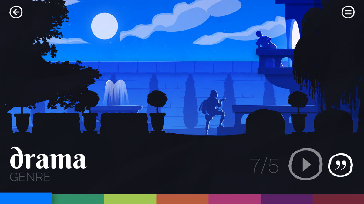
A genre select screen. Each genre was going to have its own parallax background to set the mood.
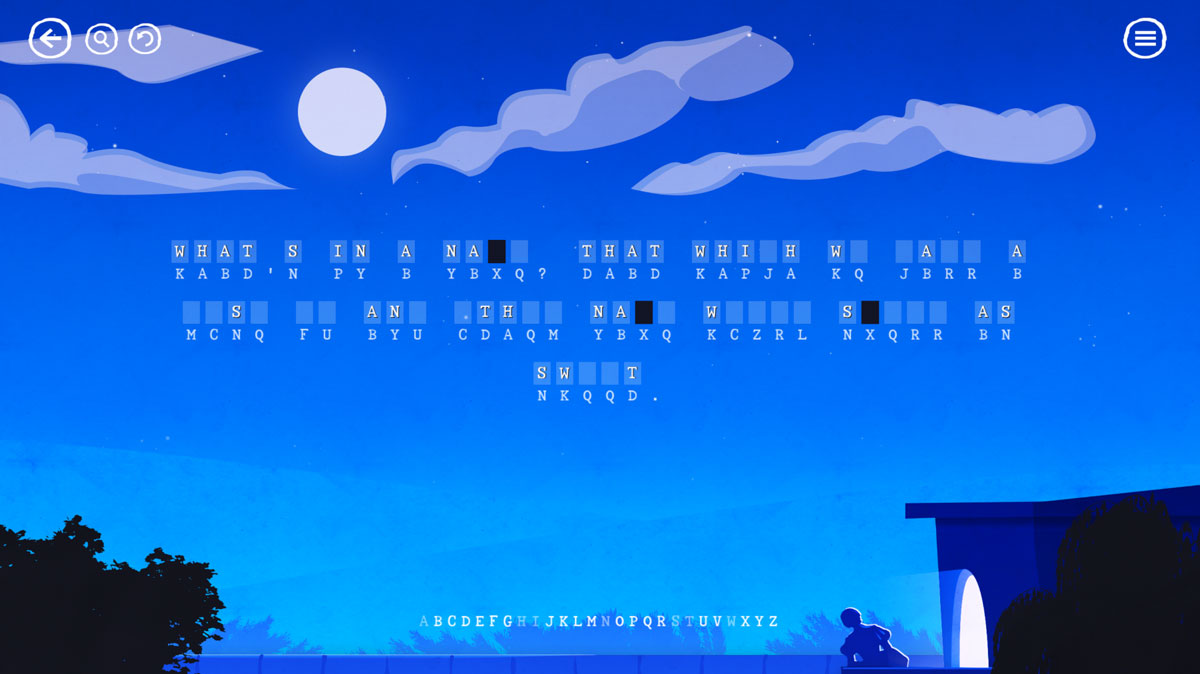
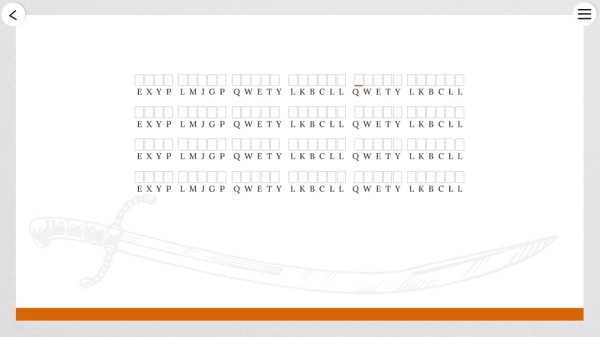
Upon clicking play, the screen would pan up and the cipher would appear.
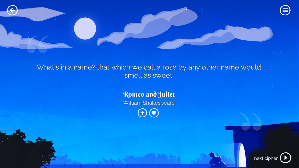
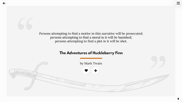
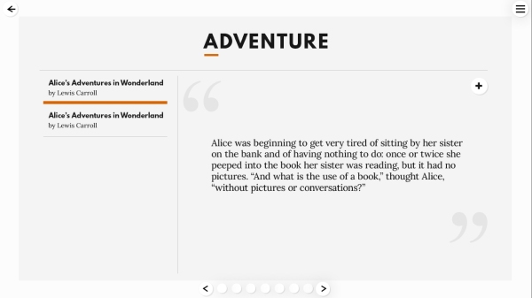
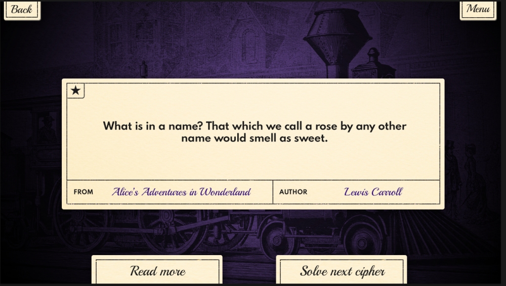
When solved, the cipher disappeared and brought up the formatted quote.
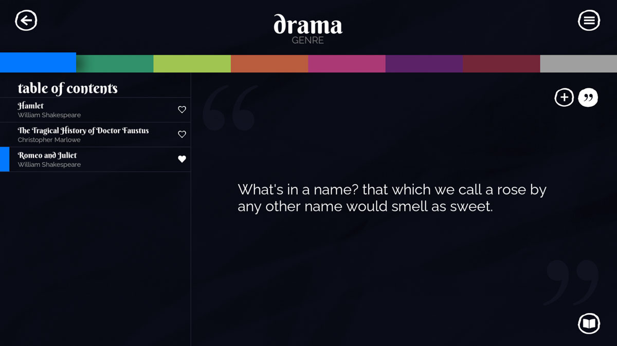
Where players could review their completed quotes.
This version was a fully working prototype--and I was certain it would be the final design--but it, too, met the axe. I wanted illustrations that would set the mood for each genre but had trouble coming up with "generic" scenes.
They needed to fit every single quote, which proved to be an enormous challenge. Naturally, the alternative was making multiple illustrations per genre, but that would push us way out of scope time-wise.
The second issue was legibility for the cipher itself. If I was going to spend all that time making animated illustrations, I wanted to make sure the player got to see them for longer than 2 seconds. Reusing
them for the cipher and the win screen seemed like a good idea, but it was a struggle making it all work. I wanted each genre to have its own accent color, but what looks good and legible on blue does not necessarily
look good on red. Any way I sliced it, I had to admit it just wasn't working.
The Floundering
When I realized I needed to radically redesign again, I felt extremely defeated. I had worked on this iteration for a month straight and felt a lot of fondness for it. At this point in development,
I had already decided to use books from Project Gutenberg, and I really wanted a nice demo to show when I let them know about the project.
I also had discovered--while testing the prototype--that puzzling over a cipher put me in the perfect state of mind to appreciate the depth and meaning of these quotes.
When I started, I chose literature as my quote source because it provided such plentiful material (and it interested me personally). I didn't really think much about how well ciphers and books were suited,
nor was I trying to get players to become interested in books. Yet, the more I played it, the more I found myself wanting to read these books!
It was a lovely accident, and it seemed to stir up a sense of wonder in me. As I hunted for the perfect quotes, I started to fall in love with all the classics again, and I really wanted to share that with players.
After a little break, I went back to the drawing board--this time with a better understanding of what the game needed, but not necessarily what it should look like. So, a furious mockup process began.
I tried everything from cutesy:
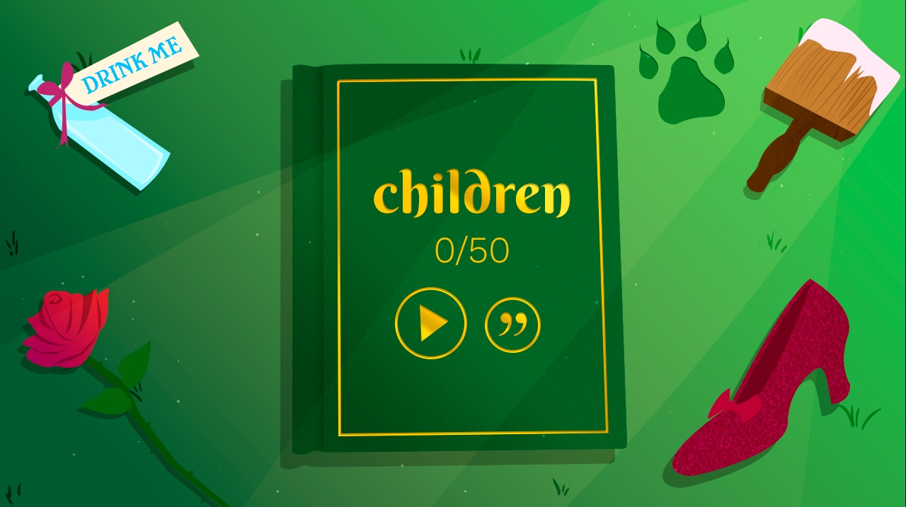
In this version, objects from stories would appear around the screen as you solved ciphers.
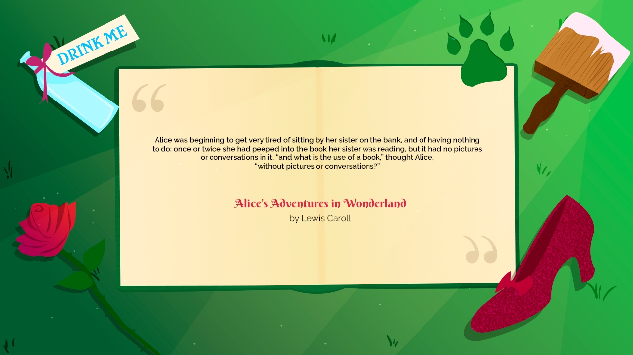
Every bit of text in the game would appear on the book.
To clean:
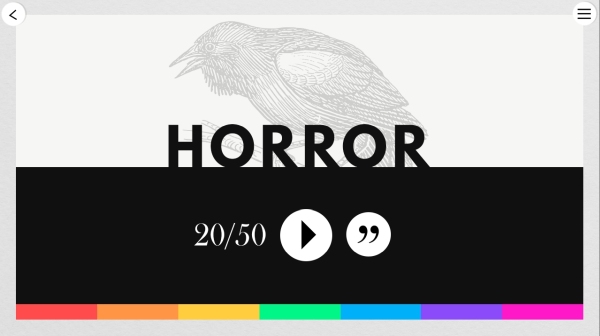
And finally, the complete opposite:
I ran them by some fresh eyes and the deliberations began. Cutesy was...well, too cutesy. There was something odd about looking at these extremely serious and profound quotes against a cartoon background, and it never seemed to look good with the horror quotes. As for the modern design, it sort of fit with the minimal aesthetics of Anagrams.
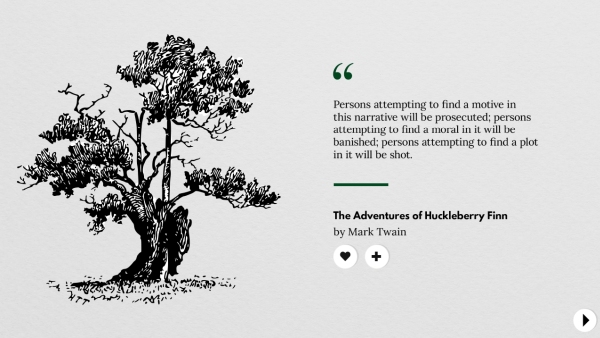
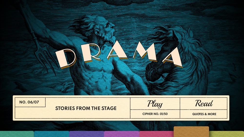
It also seemed like it might be good to present these books--some of which are literally over 1,000 years old--in a sleek, clean design. But in the end, everyone agreed: vintage was definitely the one.
In early April, I began adapting the existing prototype, and everything kind of fell into place. By the end of May, I got Project Gutenberg's blessing and published a demo on itch.io.
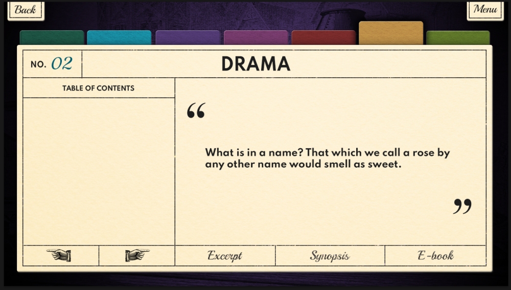
The Home Stretch
At that point, I kind of thought I was done. After all, I had achieved my goal! I learned how to program a complete game and was basically ready to put it up for sale, but I had no intention of
selling on Steam--until the itch.io player feedback started coming in. People were telling me how nice it was to contemplate the quotes, with some even saying it inspired them to start reading again.
It seemed like I had really succeeded at sharing my own experience with players, so Carl encouraged me to polish up the demo for Steam Next Fest in October 2021.
I updated all the textures, carefully selected quotes, wrote synopses (so many synopses), sourced vintage backgrounds, and agonized over font choices for a few months until the festival arrived. I was super nervous
(we changed some very substantial code only one week before the event), and Steam was encouraging everyone to do two livestreams of their demo. We decided to just go for it and ended up having a blast.
The game was very well received, and I had a huge grin on my face as I read all the feedback (even the negative!).
I think my months of agonizing over the design ended up paying off, and I'm really happy with the way Prose & Codes turned out. It was and continues to be a true labor of love.


